Create Excel Pie Charts Using Python openpyxl
In this tutorial, we will show you how to create simple and 3-D pie charts using openpyxl – a Python library to work with Excel.
How to create Pie charts using openpyxl library
In this tutorial, we will show you how to create 3-D pie charts using openpyxl – a Python library to work with Excel.
Creating a 3-D pie chart by openpyxl
For creating a 3-D pie chart, we will provide data for series and labels in the form of a Python list.
See the Python program below and we will explain how it worked after the output:
from openpyxl import Workbook

from openpyxl.chart import (

    PieChart3D,

    Reference

)

#Creating Workbook and specify active sheet

wb_pie_chart = Workbook()

ws_pie_chart = wb_pie_chart.active


#Data for the Pie chart

data = [

    ("Type of Expense", "Amount Spent"),

    ("Grocery", 300),

    ("Electricity", 150),

    ("Child Tuition", 125),

    ("House Keeping", 35),

    ("Gardening", 30),

    ("Misl. Expense", 500),

]

#Appending data to the Excel sheet - for Pie chart

for row in data:

    ws_pie_chart.append(row)


#Specify parameters for pie chart

pie = PieChart3D()

labels = Reference(ws_pie_chart, min_col=1, min_row=2, max_row=7)

data = Reference(ws_pie_chart, min_col=2, min_row=1, max_row=7)

pie.add_data(data, titles_from_data=True)

pie.set_categories(labels)

pie.title = "Expenditures Pie Chart"


#Where to display Pie chart in the Sheet

ws_pie_chart.add_chart(pie, "C10")


#Save the Workbook

wb_pie_chart.save("demo_pie3D.xlsx")
Output:
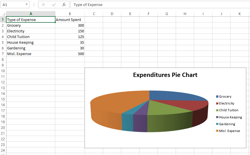
For the pie chart in a new sheet with data, you may specify:
- You have to import openpyxl.chart (PieChart3D and Reference) at the beginning of the program
- Title of the Pie (That appeared as “Inflation Pie Chart” in our example)
- Specify which columns and rows to use data in the Excel sheet for the pie chart
- The column that acts as the labels in the pie chart (Grocery, Electricity, etc.)
- Data to be associated with labels in the Excel sheet
- The add_chart method of the sheet object is used where we can specify where to display the pie chart.
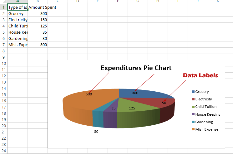
How to display data labels in the pie chart
In the above output, you can see the Pie chart is displayed with “Pies” for labels without displaying the data associated with each pie - (Amount Spent) column B.
In order to display data labels, for example, 300 for Grocery, 150 for Electricity, etc., you may import the DataLabelList from openpyxl and use it as shown in the example below:
from openpyxl import Workbook

from openpyxl.chart.label import DataLabelList

from openpyxl.chart import (

    PieChart3D,

    Reference

)

#Creating Workbook and specify active sheet

wb_pie_chart = Workbook()

ws_pie_chart = wb_pie_chart.active


#Data for the Pie chart

data = [

    ("Type of Expense", "Amount Spent"),

    ("Grocery", 300),

    ("Electricity", 150),

    ("Child Tuition", 125),

    ("House Keeping", 35),

    ("Gardening", 30),

    ("Misl. Expense", 500),

]


#Appending data to the Excel sheet - for Pie chart

for row in data:

    ws_pie_chart.append(row)


#Specify parameters for pie chart

pie = PieChart3D()

labels = Reference(ws_pie_chart, min_col=1, min_row=2, max_row=7)

data = Reference(ws_pie_chart, min_col=2, min_row=1, max_row=7)

pie.add_data(data, titles_from_data=True)

pie.set_categories(labels)

pie.title = "Expenditures Pie Chart"


#Showing Data Labels in 3-D pie chart

pie.dataLabels = DataLabelList()

pie.dataLabels.showVal = True


#Where to display Pie chart in the Sheet

ws_pie_chart.add_chart(pie, "C10")


#Save the Workbook

wb_pie_chart.save("demo_pie3D.xlsx")
Output:
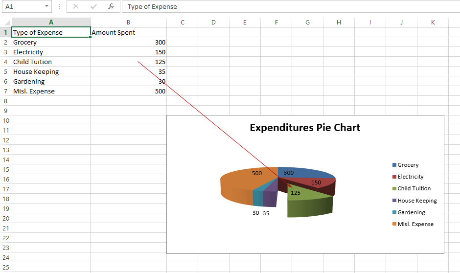
Cutting the slice of pie example
In the above two examples, the pie chart is a complete circle based on series and data labels.
You may cut the slice to separate it from the pie circle.
For that, import the DataPoint in the beginning section. See the code and output and a little explanation:
from openpyxl import Workbook

from openpyxl.chart.label import DataLabelList

from openpyxl.chart import (

    PieChart3D,

    Reference

)

from openpyxl.chart.series import DataPoint


#Creating Workbook and specify active sheet

wb_pie_chart = Workbook()

ws_pie_chart = wb_pie_chart.active


#Data for the Pie chart

data = [

    ("Type of Expense", "Amount Spent"),

    ("Grocery", 300),

    ("Electricity", 150),

    ("Child Tuition", 125),

    ("House Keeping", 35),

    ("Gardening", 30),

    ("Misl. Expense", 500),

]


#Appending data to the Excel sheet - for Pie chart

for row in data:

    ws_pie_chart.append(row)


#Specify parameters for pie chart

pie = PieChart3D()

labels = Reference(ws_pie_chart, min_col=1, min_row=2, max_row=7)

data = Reference(ws_pie_chart, min_col=2, min_row=1, max_row=7)

pie.add_data(data, titles_from_data=True)

pie.set_categories(labels)

pie.title = "Expenditures Pie Chart"


#Showing Data Labels in 3-D pie chart

pie.dataLabels = DataLabelList()

pie.dataLabels.showVal = True


# Cut the slcies  - 3rd in that case

slice = DataPoint(idx=2, explosion=50)

pie.series[0].data_points = [slice]


#Where to display Pie chart in the Sheet

ws_pie_chart.add_chart(pie, "C10")


#Save the Workbook

wb_pie_chart.save("demo_pie3D.xlsx")
Output:
Notice the following code in the beginning:
from openpyxl.chart.series import DataPoint
and this section in the code below:
slice = DataPoint(idx=2, explosion=50)
pie.series[0].data_points = [slice]
The idx is the parameter where you may specify which cell of the Excel should be sliced.
It’s a 0-based index, so “Child Tuition” is sliced in our Pie chart.