Create 3-D Column Charts in Excel
Alternatively, you may go to “Recommended Charts” and in the dialog box, click “All Charts”.
How to create 3-D column chart in Excel?
For creating a 3-D column chart in Excel, you may access it in the following ways.
Step 1:
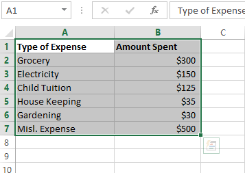
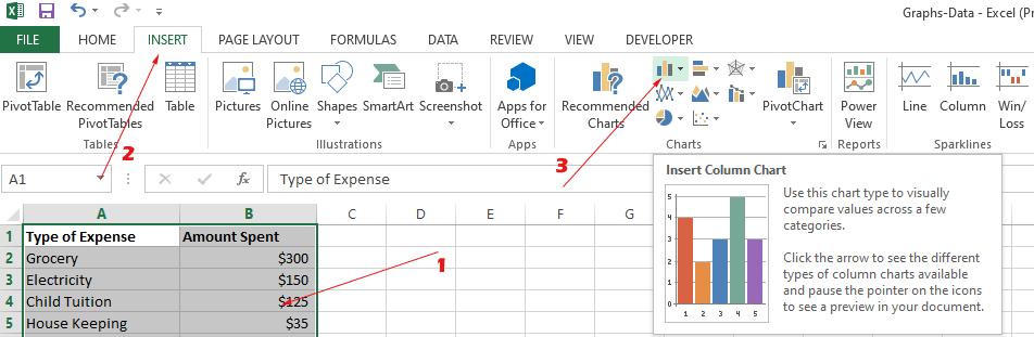
Select the data you want to create a 3-D column for. We have this sample data:
Step 2:
In the “Insert” tab, locate the following in the charts group:
Alternatively, you may go to “Recommended Charts” and in the dialog box, click “All Charts”.
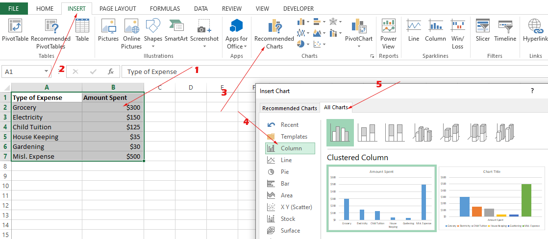
“Column” should be selected by default. If not, click on “Column”
Step 3:
There, you can see various options for creating the columns chart. These include
- Clustered Column chart
- Stacked Column
- 100 % Stacked Column
- 3-D Clustered Column
- 3-D Stacked Column
- 3-D 100 % Stacked Column
- 3-D Column
While you may choose any of the available charts, our topic for this tutorial is the “3-D Column” chart, the last one:
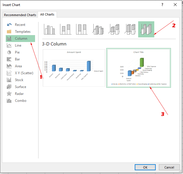
Click Ok, after selecting the chart.
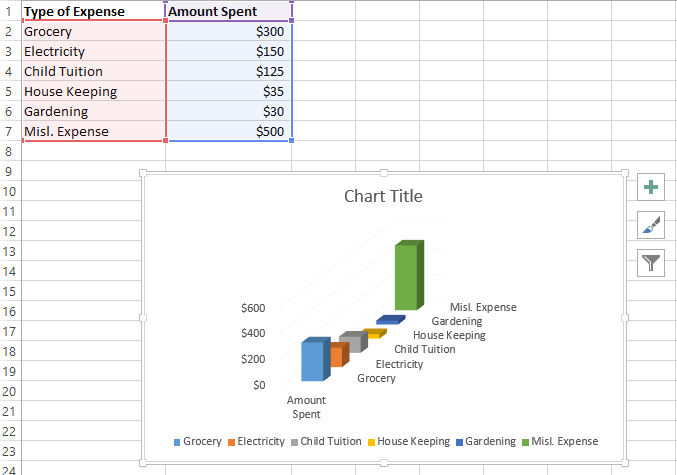
Result:
Customizing the column chart as per requirements
Now, let us have a look at a few options available to customize the column chart.
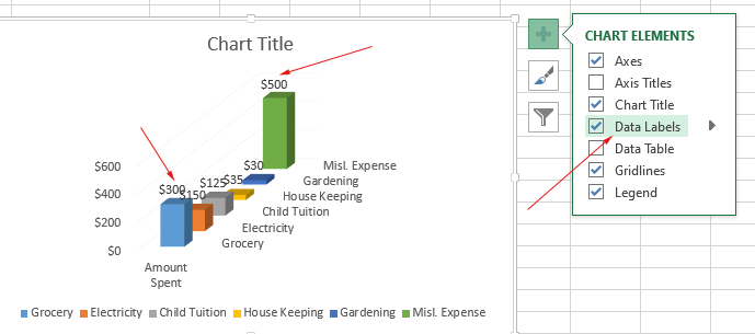
Adding Data Labels
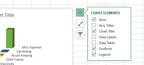
Click on the created chart (if not already) to select and you should see the + sign:
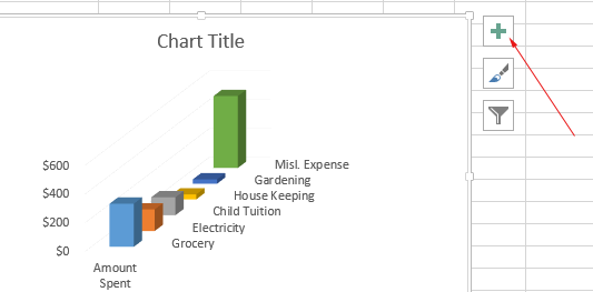
Clicking on this will open the “Chart Elements” with a few checkbox options.
Click on the “Data Labels” and it will display the amount (data) with each corresponding column in the chart.
Other options
Similarly, you may check/uncheck the following options:
- Data Tables (shows selected data from the sheet)
- Axes
- Axes Titles
- Chart Title
- Gridlines
- Legend
Just select/unselect to see the impact on your chart.
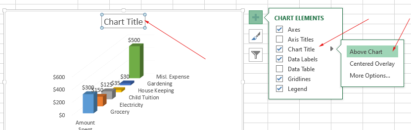
Changing the 3-D column chart title
Once you click on the “Chart Title” checkbox, it adds the title to the chart (if it’s not already added):
Click on it and edit/add the name as you want:
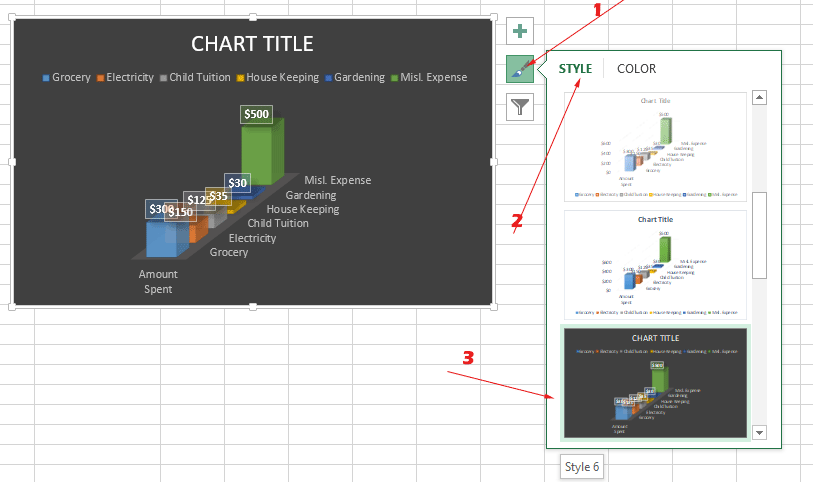
Choosing another style for a 3-D column chart
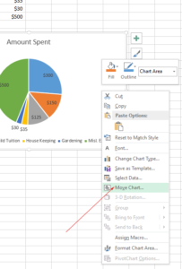
Excel has a few other style options (built-in) for 3-D column charts that you may choose by clicking on the Brush icon.
The STYLE section shows available styles. We chose Style 6 and the result is:
Modifying color scheme example
Along with STYLE, you can also see the COLOR option.
Excel has the option to choose a combination of colors for different elements of the column chart.
Choose any of the schemes and see the live impact on your chart.
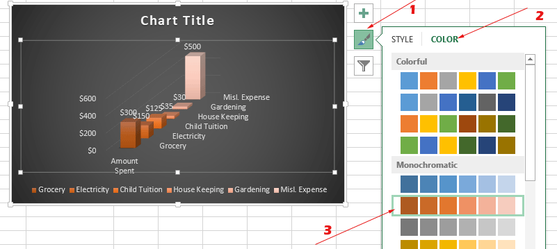
Click on the Color scheme and color is applied to the chart.